Spark +AI

Goal
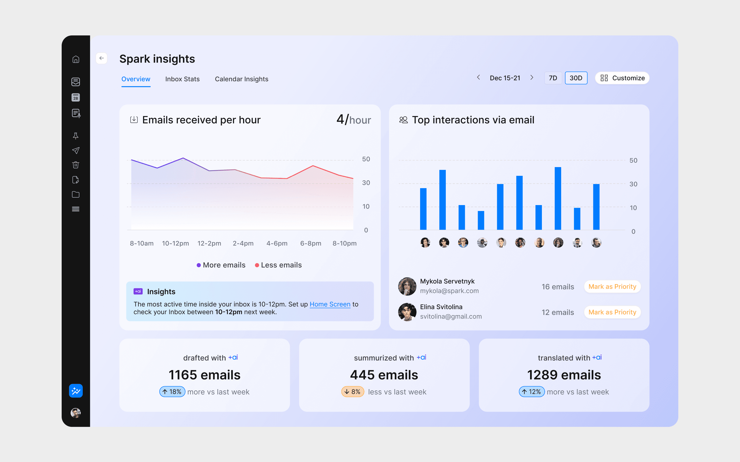
The goal was to design and build an interactive dashboard that visualizes email activity, key categories, and engagement trends, empowering users to improve productivity and communication habits.
• Surface clear, actionable insights that help users understand and optimize their daily email workload.
• Drive retention high-value features that keep users choosing Spark over other email clients.
Problem to solve
Users struggle to understand their email usage patterns and identify actionable insights from their inbox.
They lack visibility into how effectively they spend time in their inbox. Many feel overwhelmed by email volume but don’t know which habits slow them down or how to improve.
Discovery
To nail down which email metrics would truly improve day-to-day workflow, I designed and ran a survey across all target segments, ensuring the feature would serve individual users as well as entire teams
Key insight
Generic dashboards using fake or static data failed to clearly communicate the value of email statistics. Users struggled to envision practical benefits without seeing personalized, realistic insights. To accurately measure usability and effectiveness, a live, authentic data-driven prototype was essential.
Testing
Recognizing the crucial role of real data, I used Cursor to create a secure web-based prototype from scratch, test various email-statistic dashboards with actual user data.
Process
Gmail account authorization
I investigated how to securely access personal email data from Gmail using Google’s API.
Visualizing data
Selected Streamlit for Web UI as a fast, flexible way to build interactive dashboards in Python, with matplotlib for chart rendering.
Imported processed CSVs and used Streamlit’s layout tools (columns, containers) to create a responsive, two-column layout with clear spacing and visual balance.

The initial live prototype diverged from my original designs, but after multiple rounds of iteration and debugging I produced solid charts suitable for user testing.
Testing with genuine user data turned hypothetical scenarios into tangible evaluations. Participants immediately recognized the value of the dashboard, providing reliable, actionable feedback and clearly highlighting areas for optimization.

Using Cursor’s prompt-based workflow, I set up secure Gmail OAuth, fetched mailbox data, and built a Streamlit web app in Python to display it. I then used Matplotlib to turn the raw metrics into clear, interactive charts.
Results
Enhanced User Engagement
Immediate recognition and appreciation of personalized insights.
Clear Product Direction
User feedback emphasized the need for segmented insights based on job roles, significantly refining the product roadmap
Stakeholder Alignment
Real-data prototypes decisively demonstrated feature value, securing buy-in and prioritization from key stakeholders.